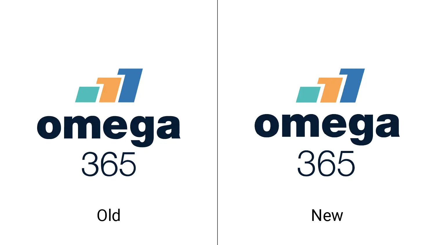
Updated logo

The design team has adjusted the logo, with the main purpose of making it more versatile and flexible in use, without losing its strong profile.
One of the key changes is that the logo now comes in a version without a circle. This makes it more user-friendly, especially in cases where it’s used alongside other companies' logos, in sponsorship work, and more. This version is called "simplified" and contains only the columns and text. The distance between the columns and text has also been adjusted for better harmony.
Another change is the switch to a thinner font for "365" so that the number and the company name are perceived as one. "365" has also been moved down a bit, so it doesn’t feel too crowded.
All the information you need about logo versions and usage can be found in our profile manual under "Logo."
If you have any questions about the logo or its usage, please reach out to Annika Ørnes Mæhle at annika@omega365.com.